Ron P
Charter Member / Competitor
Hello OPA Racers and Race Fans,
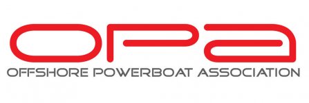
As we move toward the start of the 2010 racing season you’ll notice some changes being made along the way. The goal of these changes is to elevate the image of OPA both on and off the race course and to make OPA a more marketable property. The first and most distinguishable change is our new logo. As you can see, this logo is far more contemporary and more in line with what sponsors expect to see from a professional motorsport.
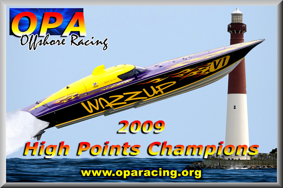
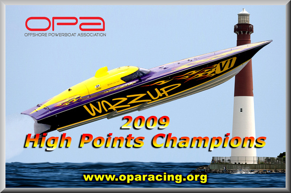
Don’t worry, we haven’t given up tradition, we’ll still use the High Points Champion logo on the boats, but for all other communications and web site graphics, this will be the new one.
Look for more news to come as the weather gets warmer.
See you at the Party,
Smitty, Augie and Louie
As we move toward the start of the 2010 racing season you’ll notice some changes being made along the way. The goal of these changes is to elevate the image of OPA both on and off the race course and to make OPA a more marketable property. The first and most distinguishable change is our new logo. As you can see, this logo is far more contemporary and more in line with what sponsors expect to see from a professional motorsport.
Don’t worry, we haven’t given up tradition, we’ll still use the High Points Champion logo on the boats, but for all other communications and web site graphics, this will be the new one.
Look for more news to come as the weather gets warmer.
See you at the Party,
Smitty, Augie and Louie