I have to give credit to the guys who built this forum !
What I just noticed is it does not blow it out to the right, but what it does is squeezes the extra space needed out of the left. It thins out my screen name area which I think is great !!!
I would rather see that than having people scroll to read text.
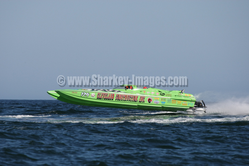
If anyone feels the 800 X 533 pixel pics are to overpowering, I will just use the next size down which is 580 X 386 pixels.
On pics in general:
I like the attachment style too. You can preview it in the post, get a better look if you want, and blow it up to the largest and copy it in a new browser if you want.
Tim the 800x386 are cool. Just as long as they don't make you have to go side to side to see'em I hate it when that happens. What you have there is great!!!!
Tim the 800x386 are cool. Just as long as they don't make you have to go side to side to see'em I hate it when that happens. What you have there is great!!!!
I like how the site absorbs just a bit into the left before blowing out to the right.
I too hate when I have to scroll left to right to read as well so I am careful of it so that it does not happen.
I like how the site absorbs just a bit into the left before blowing out to the right.
I too hate when I have to scroll left to right to read as well so I am careful of it so that it does not happen.
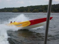
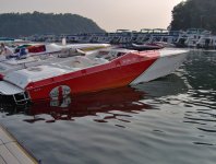
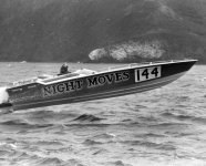
I thought it was actually Schoenwalds boat, but, going back and checking pics... his is a T/S.
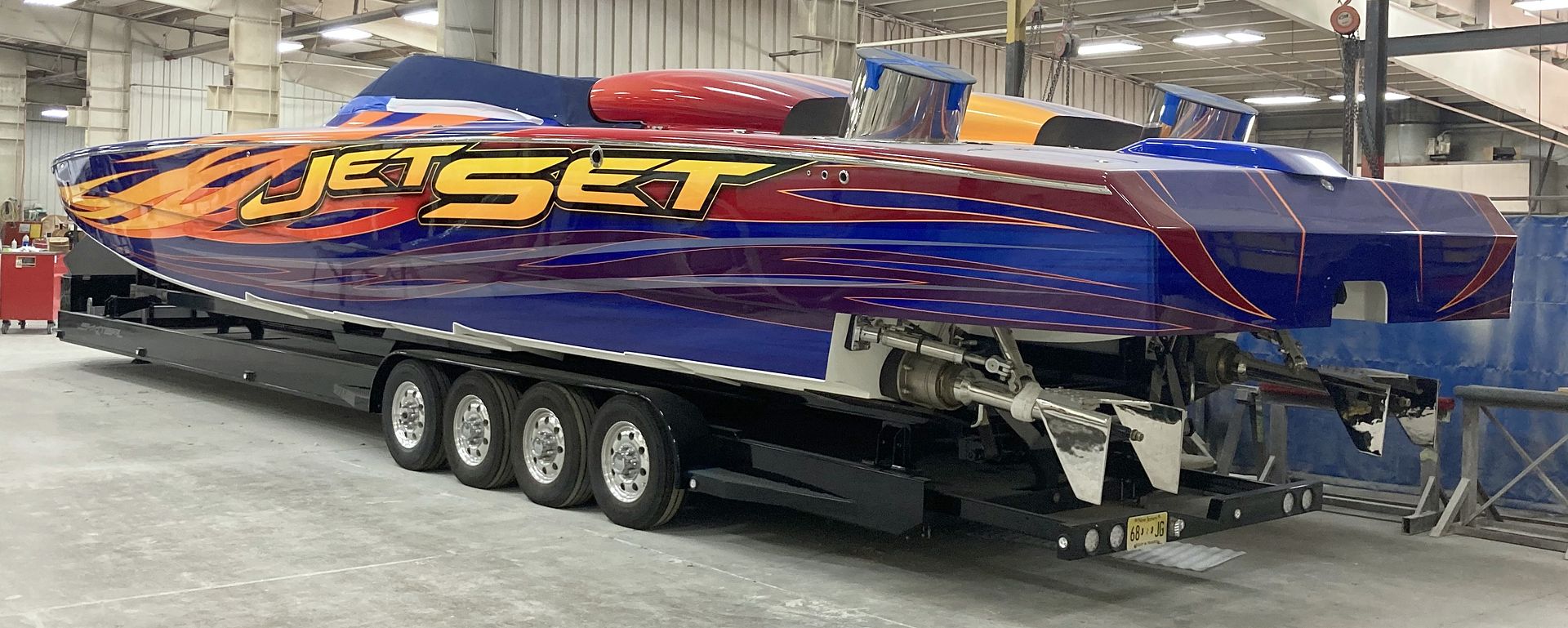
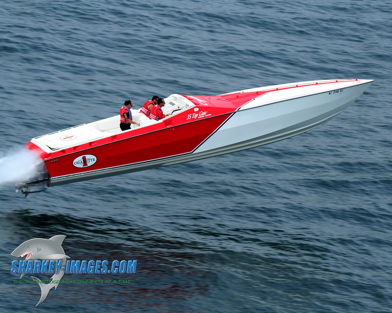
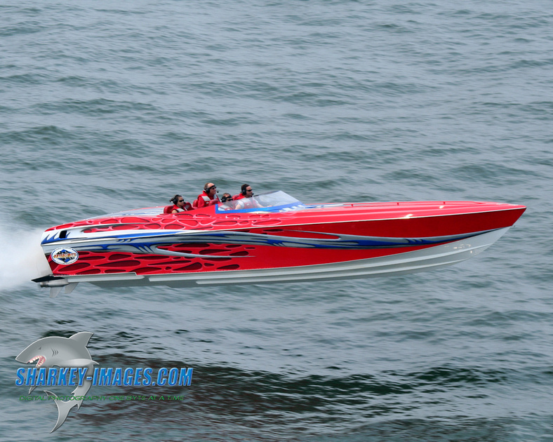
I love the simple paint design. It works great on that boat.